The Architectural Toolbox
A well-designed home means all the pieces were put together just right. You can’t put your finger on what makes it great, because it isn’t just one thing. Its many decisions, thoughtfully made, that result in a cohesive vision. When the architectural tools of materials, colours, scale and proportion are properly deployed, the result is a beautiful home, regardless of style.
Selection and application of materials are a crucial part of accentuating and enhancing the desired architectural style. Materials work in tandem with other components to create interest and draw attention to detail. The juxtaposition of crisp details with textured finishes adds complexity and interest to the façade.
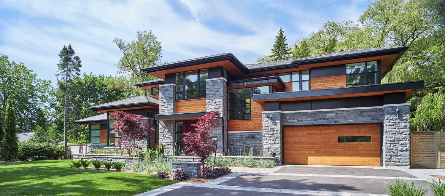
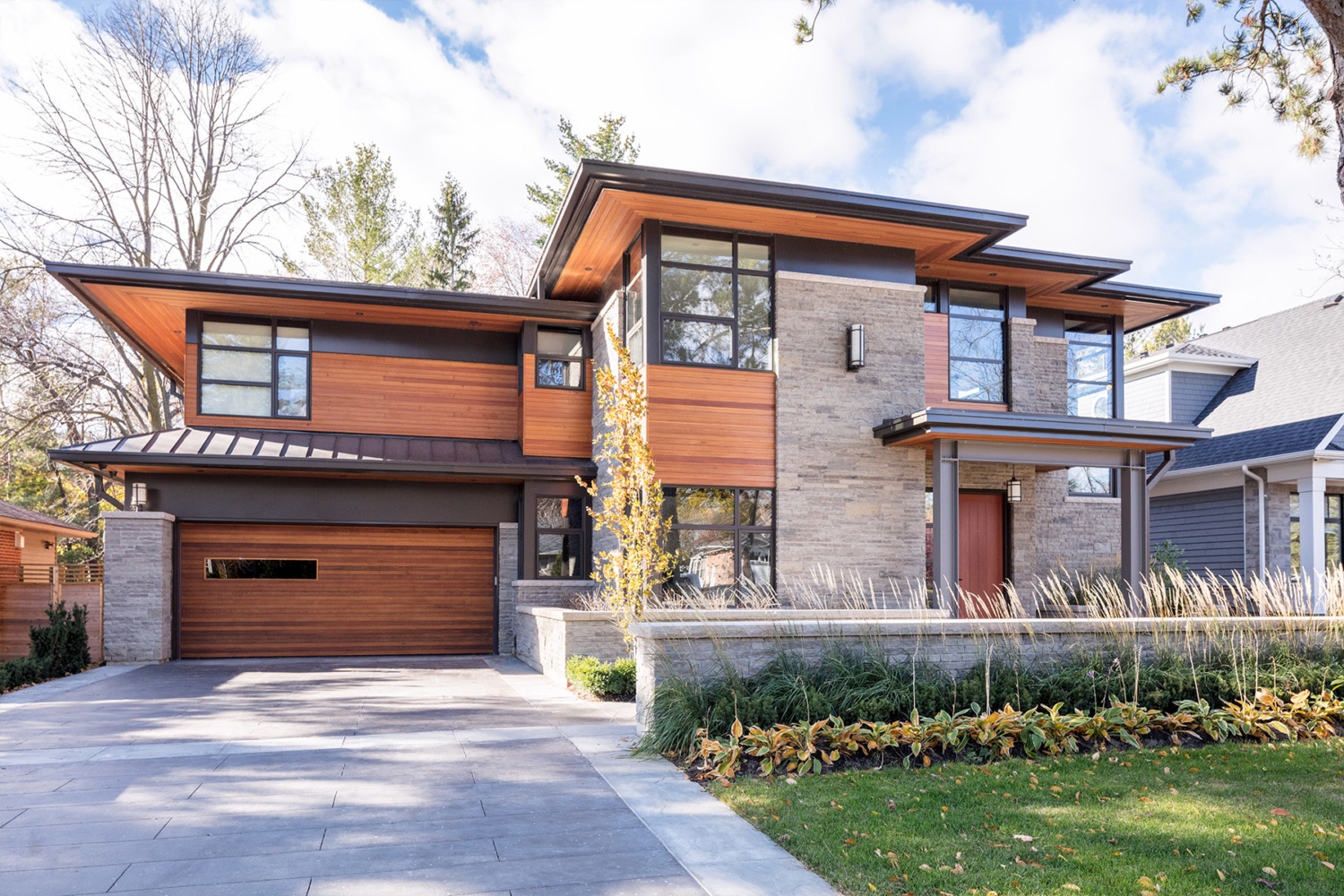
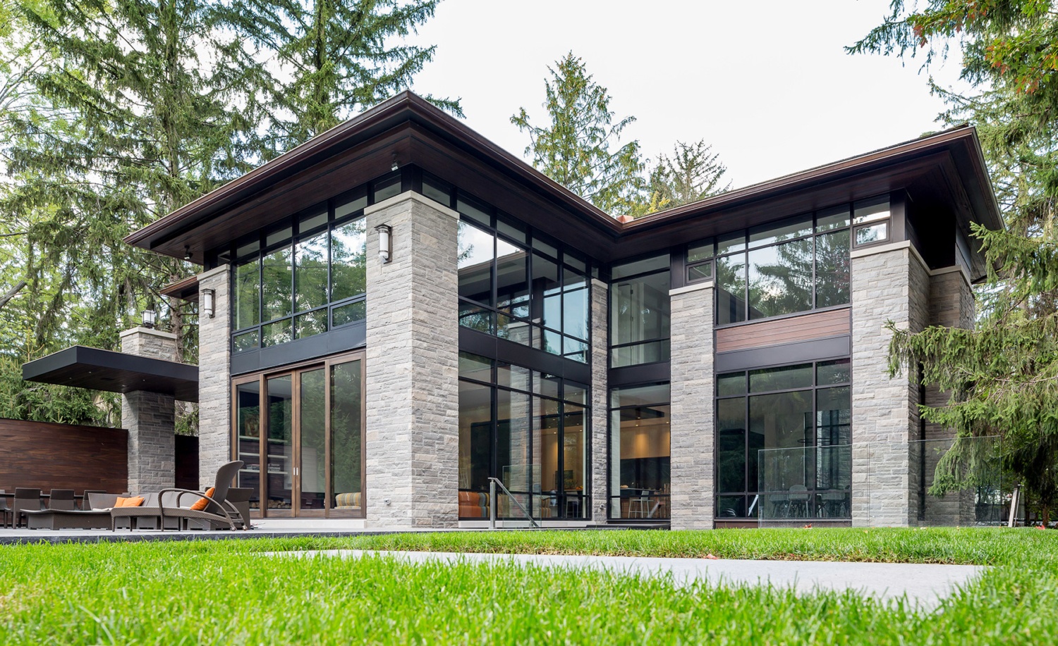
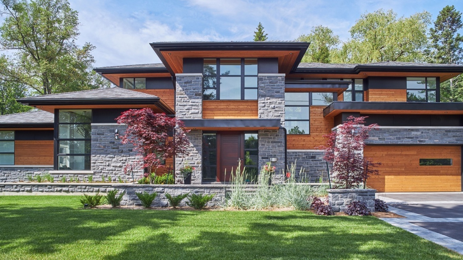 In this Natural Modern home, a mix of smooth, refined materials, like metal panel and glass, are contrasted with rugged stone and natural wood.
Exterior colour selection can make or break the design. Colour can be used to emphasize an architectural style, call out a detail, channel the homeowner’s personality, or evoke a certain mood. It’s not just about what colours are chosen, it’s about how they are applied. For this home, colour was used to emphasize the Arts & Crafts architectural style. The contrasting sage green serves as the key background colour, allowing the details to be accentuated in white.
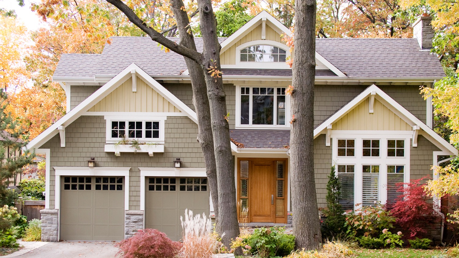 A clean but dramatic colour scheme creates interest and an Arts & Crafts appeal in our project, The Window Box.
Site integration is all about connecting building with land. Elements such as views, topography and sun orientation are critical factors in the design exercise. A key part of the home design process is creating a home that is unique and custom to the land. For this Seattle design, it became apparent that the topography of the land would dictate the narrative of the home. Three storeys were required to accommodate the living space, featuring a glass office on stilts, and an above grade basement leading to a back walkout.
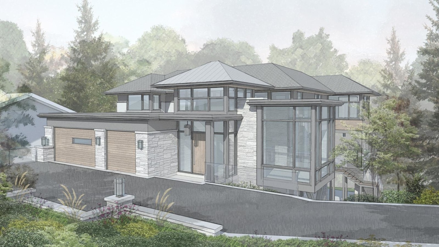 Our Sloped in Seattle design allowed for unique aspects of the property to be showcased.
Scale and proportion. The balance of thoughtful, functional space with aesthetic appeal. Scale is about size and its relationship with the human form, while proportion is about balance and the relationship between all the components. Both are crucial in great architecture. The best example of this is a renovation, where the design should be seamless, unclear where the existing home ends and the new addition begins. The goal of this Mississauga renovation was challenging: to add a second storey without overpowering the property and surrounding neighbourhood. The success in scale is seen with the embedded gables, a staple of the arts & crafts architectural style.
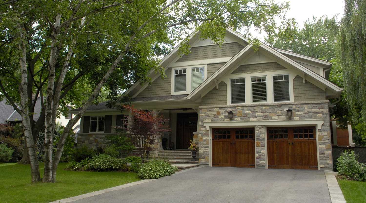 This Mineola Makeover conveys a sense of coziness and approachability using a split level second floor hidden in the tiered roofline.
To view more of our home designs, click here to view our portfolio.
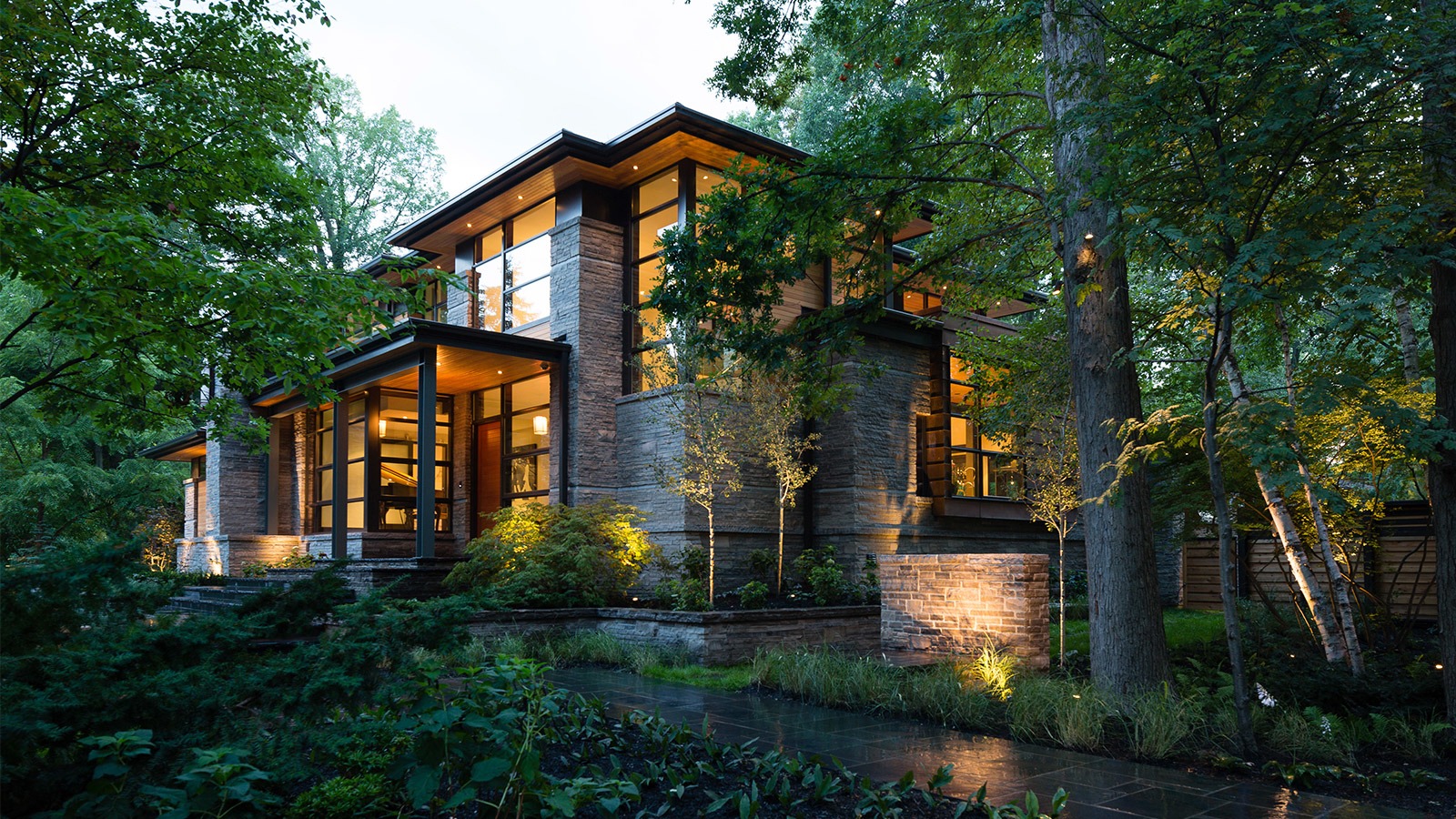 A key example of the Natural Modern style,
 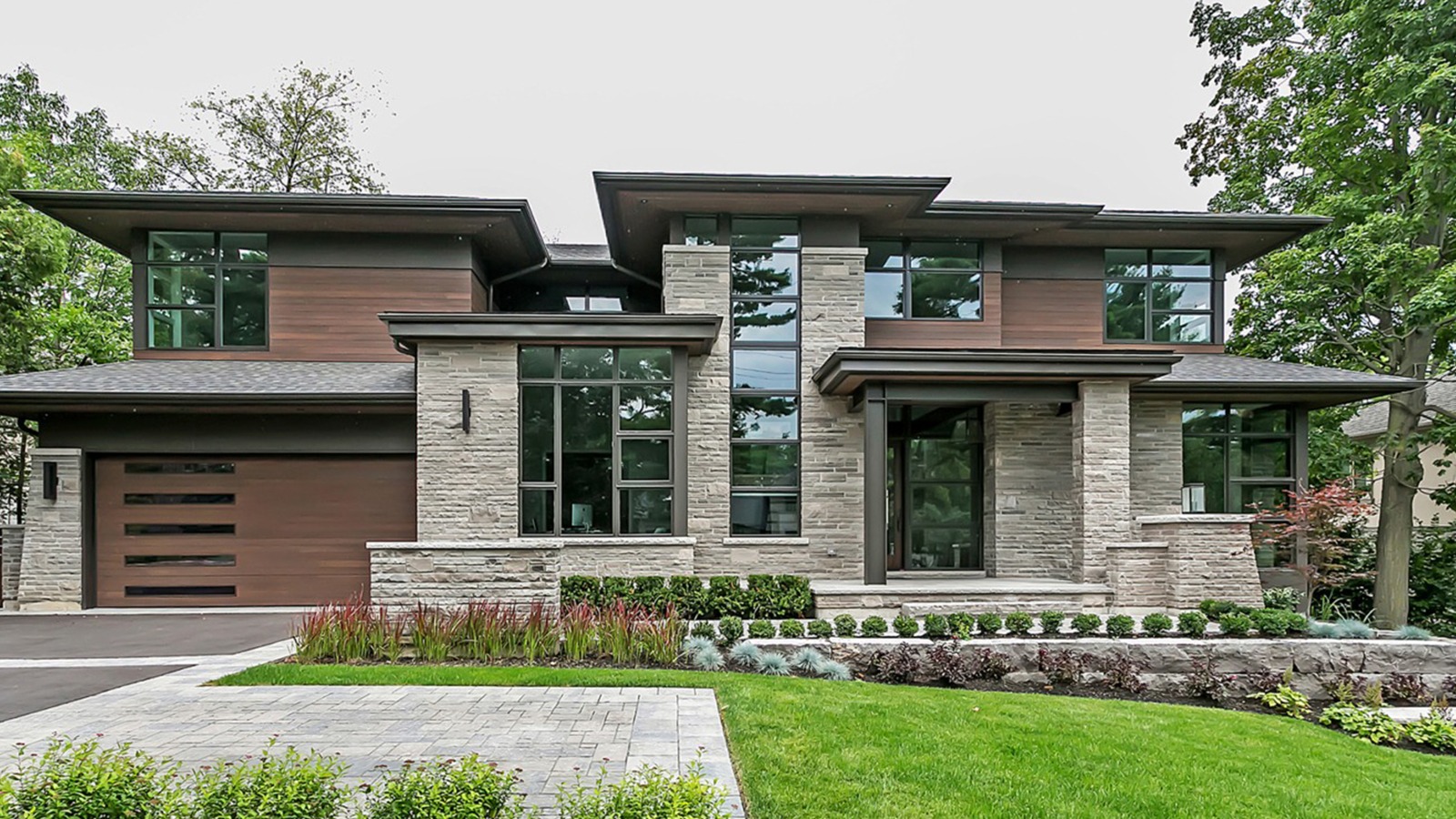 Our
Our 